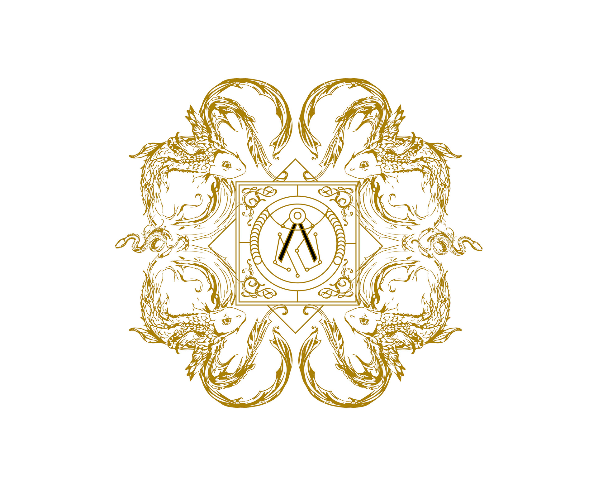
Men strive to make sense of their existence. Ambition forces them to draw the traces of their destiny, to give names and meanings to everything they create. Forced by ambition I wanted to find my purpose and give a purpose to what I do. I walked in circles for hours, with spiritual devotion. With anger and despair. In sublime silence and then I found my answer; I create so that others see the world that I have in the confines of my imagination. So they can see with my eyes, cry with my tears, and laugh with my laughter. I design to transmit emotions, to tell stories. I want people to see what I see.
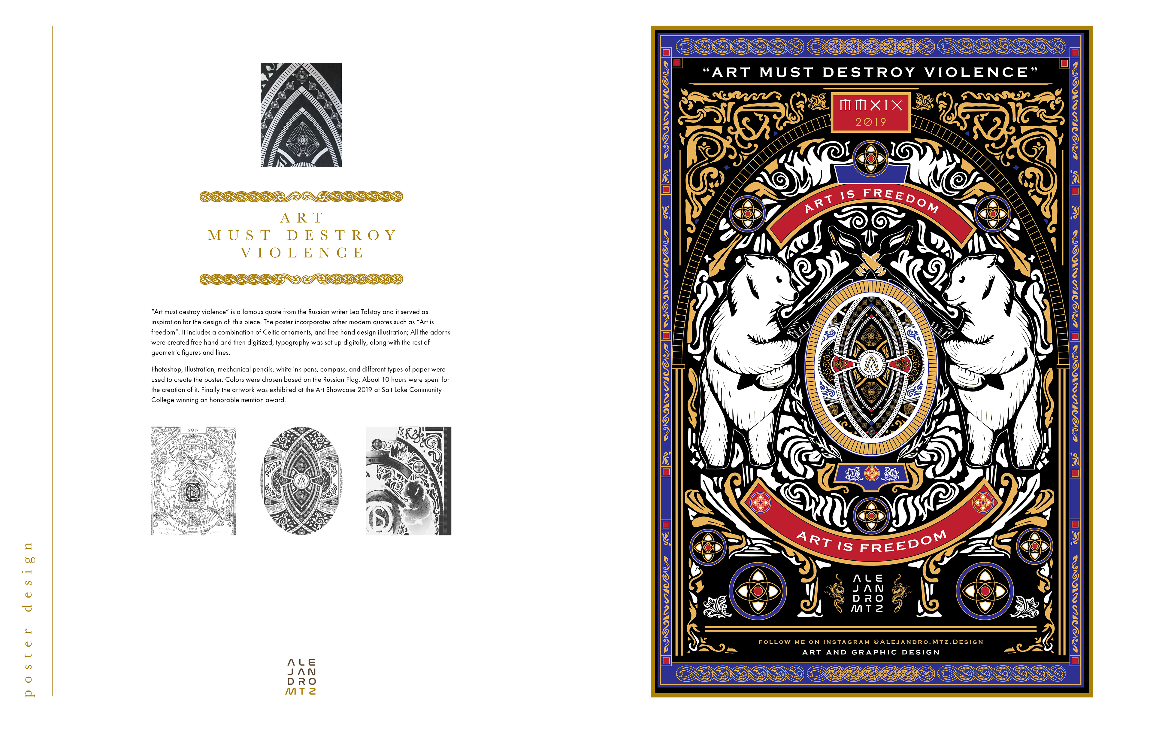
“Art must destroy violence” is a famous quote from the Russian writer Leo Tolstoy and it served as inspiration for the design of this piece. The poster incorporates other modern quotes such as “Art is freedom”. It includes a combination of Celtic ornaments, and free hand design illustration; All the adorns were created free hand and then digitized, typography was set up digitally, along with the rest of geometric figures and lines.
Photoshop, Illustration, mechanical pencils, white ink pens, compass, and different types of paper were used to create the poster. Colors were chosen based on the Russian Flag. About 10 hours were spent for the creation of it. Finally the artwork was exhibited at the Art Showcase 2019 at Salt Lake Community College winning an honorable mention award.
Photoshop, Illustration, mechanical pencils, white ink pens, compass, and different types of paper were used to create the poster. Colors were chosen based on the Russian Flag. About 10 hours were spent for the creation of it. Finally the artwork was exhibited at the Art Showcase 2019 at Salt Lake Community College winning an honorable mention award.

A Zine is a short self published magazine that contain small stories with a lot of illustration and imagery. This Zine is about Hypathia of Alexandria, an important philosopher who lived in a very interesting era, where knowledge, religion, and power were motive of war, debate and controversy.
This Zine features handmade original illustrations and a time line, all placed in a single sheet of paper fold in half and then fold in accordion fold to create the booklet. Paper was burned by hand to elude antique papyrus. Photoshop, Illustrator and InDesign were used to create it.
This Zine features handmade original illustrations and a time line, all placed in a single sheet of paper fold in half and then fold in accordion fold to create the booklet. Paper was burned by hand to elude antique papyrus. Photoshop, Illustrator and InDesign were used to create it.
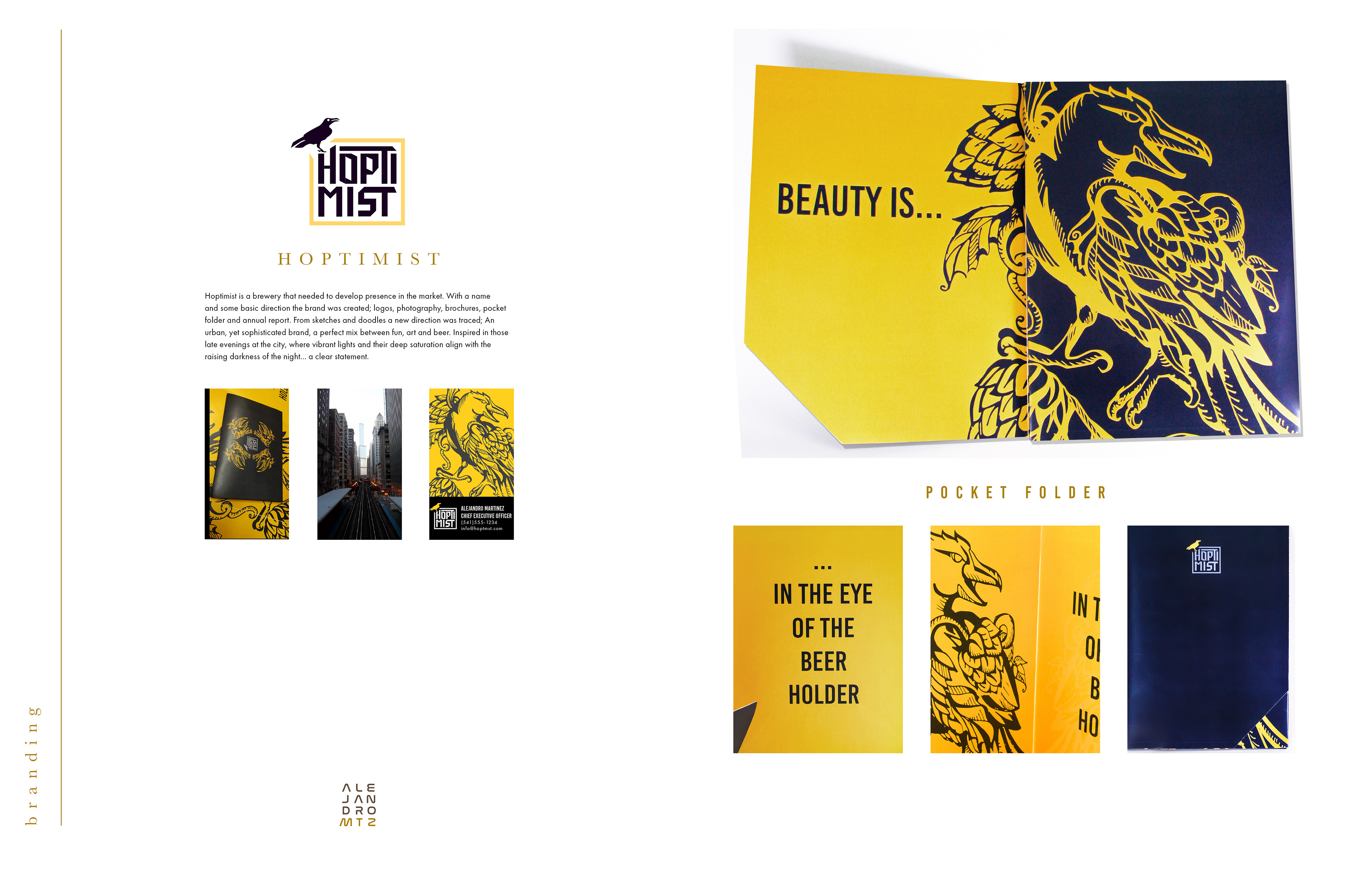
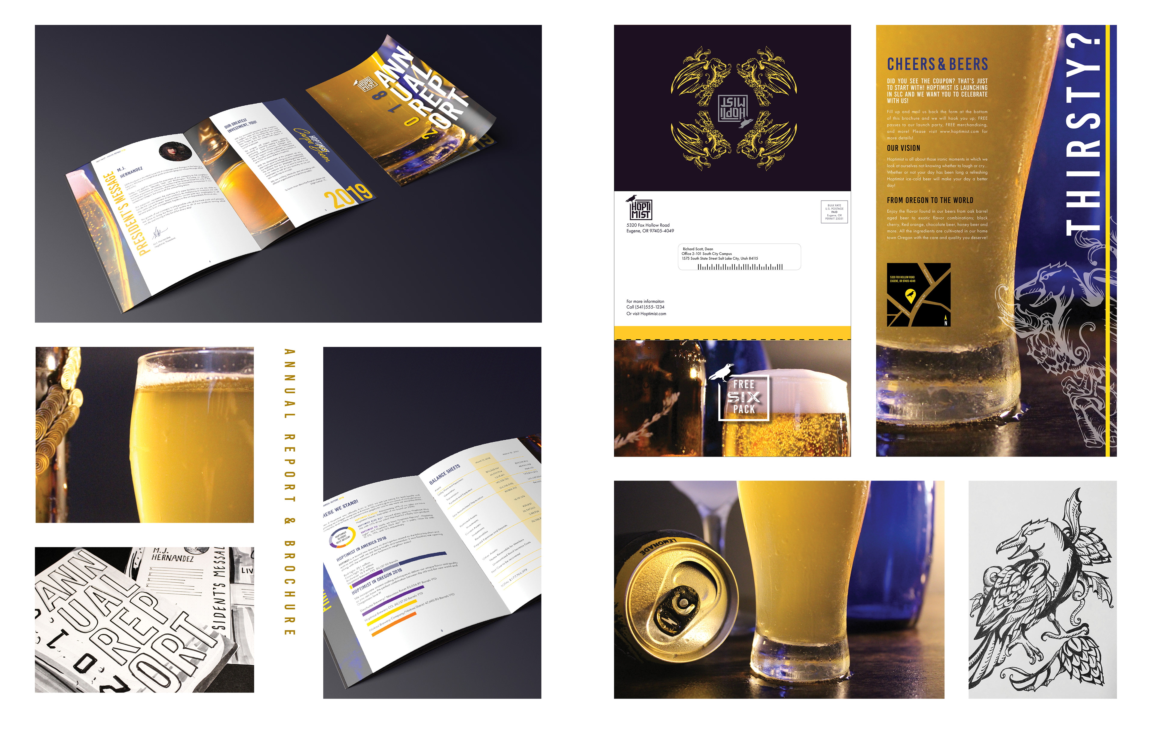
Hoptimist is a brewery that needed to develop presence in the market. With a name and some basic direction the brand was created; logos, photography, brochures, pocket folder and annual report. From sketches and doodles a new direction was traced; An urban, yet sophisticated brand, a perfect mix between fun, art and beer. Inspired in those late evenings at the city, where vibrant lights and their deep saturation align with the raising darkness of the night... a clear statement.
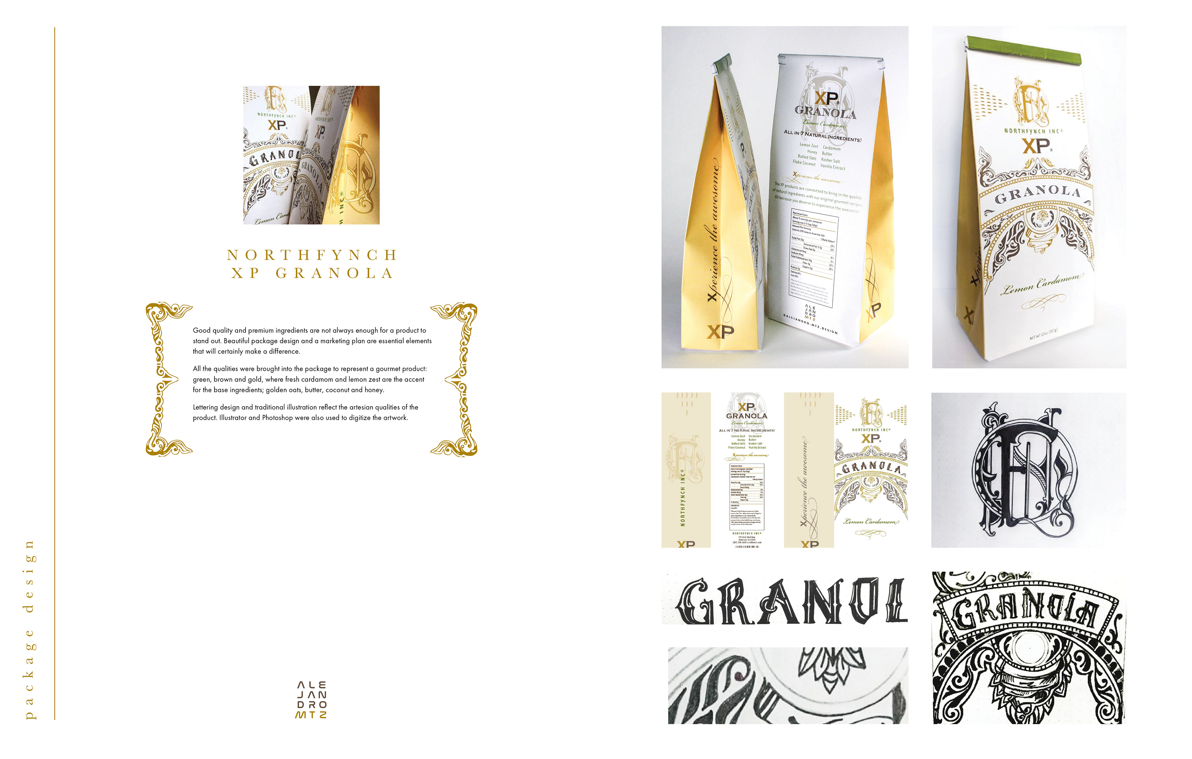
Good quality and premium ingredients are not always enough for a product to stand out. Beautiful package design and a marketing plan are essential elements that will certainly make a difference.
All the qualities were brought into the package to represent a gourmet product: green, brown and gold, where fresh cardamom and lemon zest are the accent for the base ingredients; golden oats, butter, coconut and honey.
Lettering design and traditional illustration reflect the artisan qualities of the product. Illustrator and Photoshop were also used to digitize the artwork.
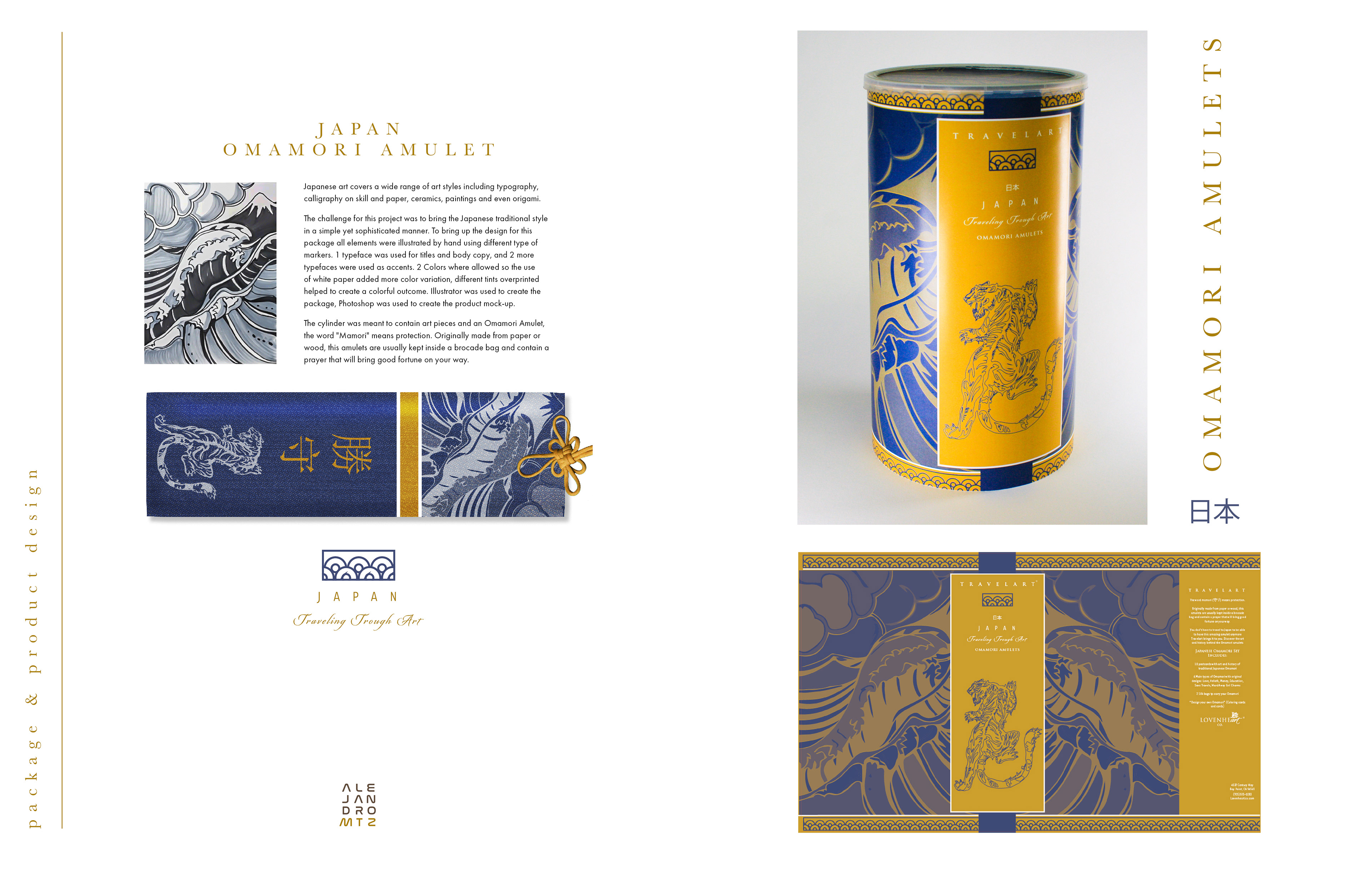
Japanese art covers a wide range of art styles including typography, calligraphy on skill and paper, ceramics, paintings and even origami.
The challenge for this project was to bring the Japanese traditional style
in a simple yet sophisticated manner. To bring up the design for this package all elements were illustrated by hand using different type of markers. 1 typeface was used for titles and body copy, and 2 more typefaces were used as accents. 2 Colors where allowed so the use of white paper added more color variation, different tints overprinted helped to create a colorful outcome. Illustrator was used to create the package, Photoshop was used to create the product mock-up.
The cylinder was meant to contain art pieces and an Omamori Amulet, the word "Mamori" means protection. Originally made from paper or wood, this amulets are usually kept inside a brocade bag and contain a prayer that will bring good fortune on your way.
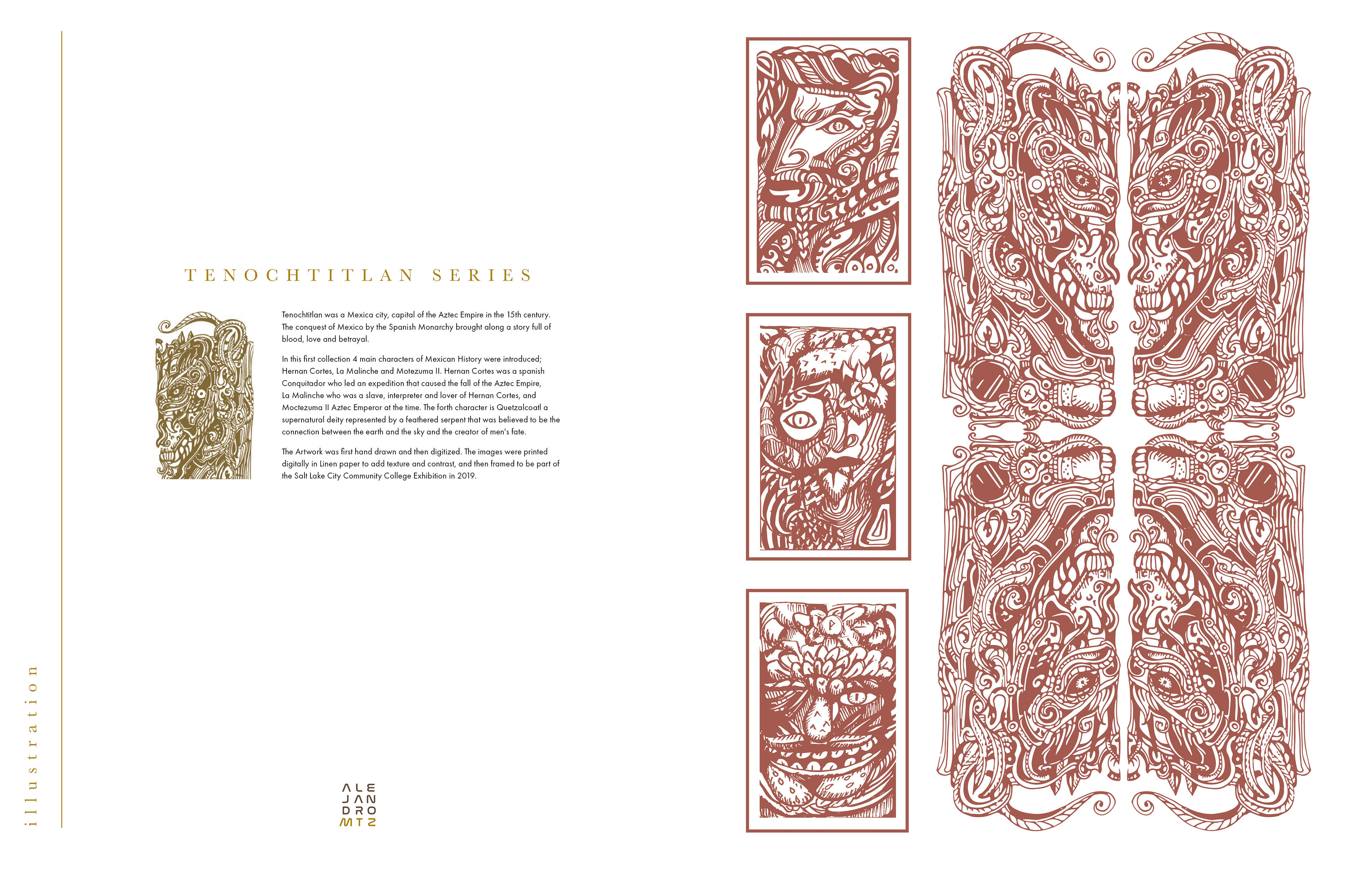
Tenochtitlan was a Mexica city, capital of the Aztec Empire in the 15th century. The conquest of Mexico by the Spanish Monarchy brought along a story full of blood, love and betrayal.
In this first collection 4 main characters of Mexican History were introduced; Hernan Cortes, La Malinche and Motezuma II. Hernan Cortes was a spanish Conquitador who led an expedition that caused the fall of the Aztec Empire, La Malinche who was a slave, interpreter and lover of Hernan Cortes, and Moctezuma II Aztec Emperor at the time. The forth character is Quetzalcoatl a supernatural deity represented by a feathered serpent that was believed to be the connection between the earth and the sky and the creator of men's fate.
The Artwork was first hand drawn and then digitized. The images were printed digitally in Linen paper to add texture and contrast, and then framed to be part of the Salt Lake City Community College Exhibition in 2019.
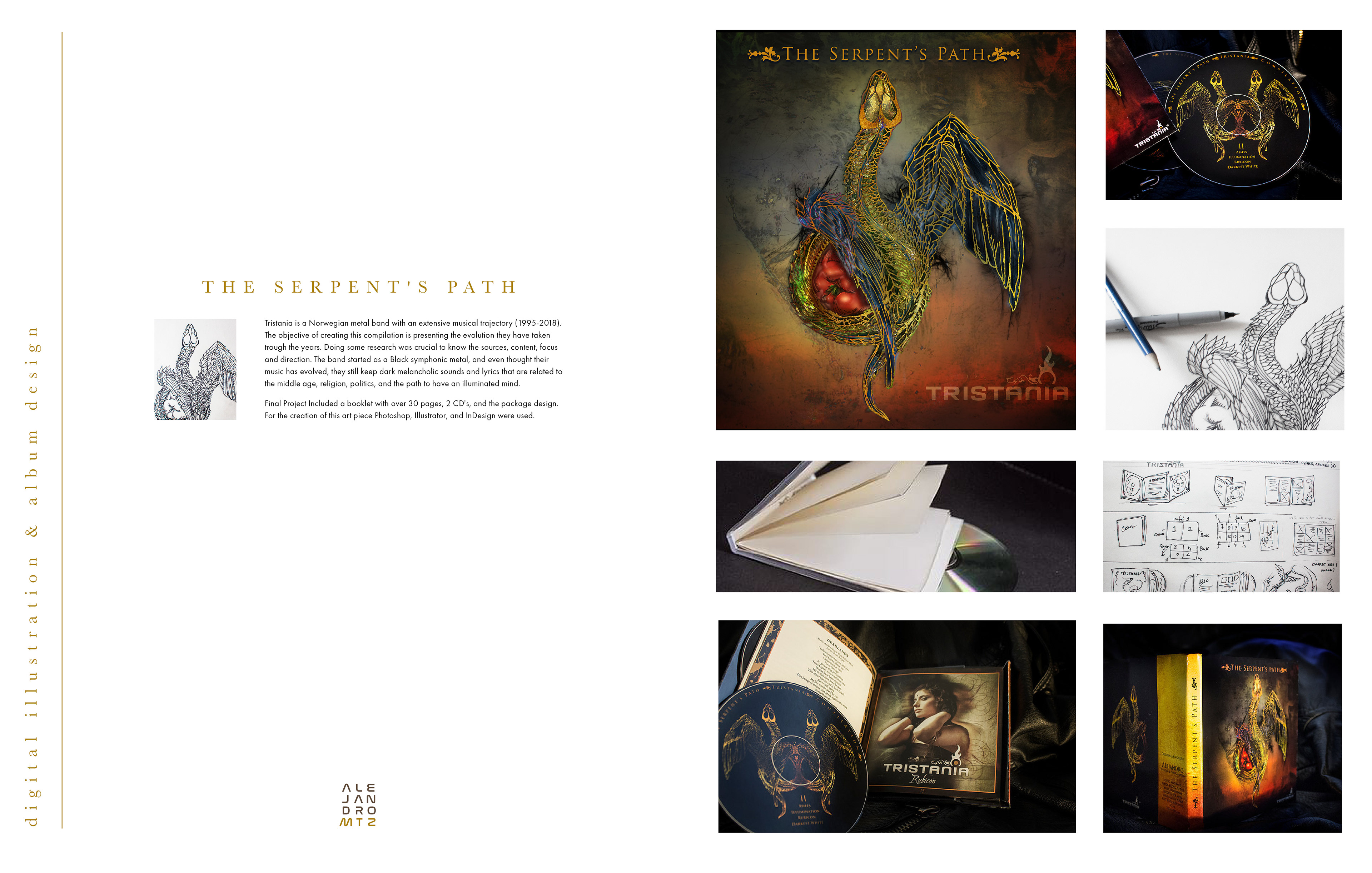
Tristania is a Norwegian metal band with an extensive musical trajectory (1995-2018). The objective of creating this compilation is presenting the evolution they have taken trough the years. Doing some research was crucial to know the sources, content, focus and direction. The band started as a Black symphonic metal, and even thought their music has evolved, they still keep dark melancholic sounds and lyrics that are related to the middle age, religion, politics, and the path to have an illuminated mind.
Final Project Included a booklet with over 30 pages, 2 CD's, and the package design. For the creation of this art piece Photoshop, Illustrator, and InDesign were used.
Final Project Included a booklet with over 30 pages, 2 CD's, and the package design. For the creation of this art piece Photoshop, Illustrator, and InDesign were used.


